

Type history gets written from New York and London. Canadian contributions are rarely taught, even though three homegrown typefaces span a national constitution, a design-industry default, and one of the most linguistically inclusive fonts a government has ever commissioned. Here are the three worth knowing.

Cartier by Carl Dair (1967)
In 1967, the Governor General commissioned graphic designer Carl Dair to build Canada’s first original text typeface. Dair named it Cartier, after explorer Jacques Cartier, and timed its release to the Centennial.
Dair spent a decade on the design. He died the same year Cartier was released, before its technical flaws (uneven weights, inconsistent stroke angles) could be fixed. The typeface still went on to set the Canadian Charter of Rights and Freedoms in 1982.
In 2000, type designer Rod McDonald revisited Dair’s original drawings and released Cartier Book, a digital revival that corrected the structural issues while keeping Dair’s character. Typographer Robert Bringhurst, author of The Elements of Typographic Style, considers McDonald’s version one of Canadian typography’s defining achievements. A more literal restoration, called Dair, followed from type foundry ShinnType in 2017.

Gibson by Rod McDonald (2011)
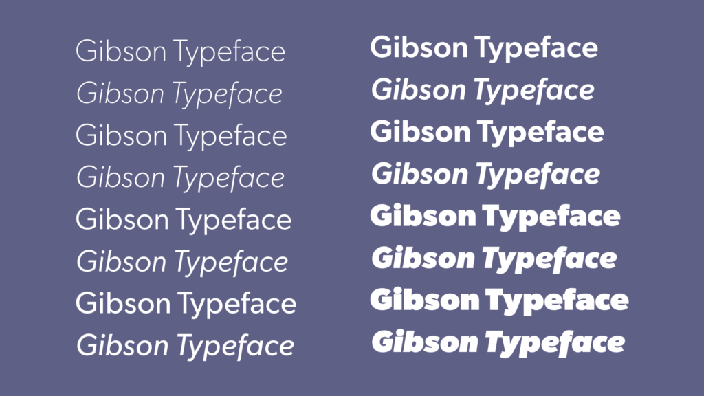
Rod McDonald designed Gibson as a tribute to his friend John Gibson, a co-founder of the Society of Graphic Designers of Canada. Canada Type released it in 2011, in nine weights with matching italics.
Gibson became the most-used Canadian-designed typeface, in Canada and abroad. Design schools across the country folded it into their curricula.

Canada 150 (2017) by Raymond Larabie
The federal government approached designer Raymond Larabie in 2015 to build the official typeface for Canada’s 150th anniversary. Larabie adapted it from Mesmerize, a geometric sans serif he’d released the year before.
The brief asked for English and French support. Larabie added character sets for more than 50 Indigenous languages and worked with the Unicode Consortium to properly support Cree. He donated the work for free.
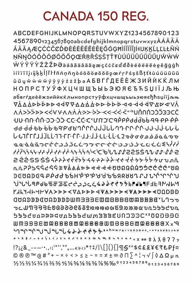
Source: Government of Canada, Canada 150 logo info page (Open Government Licence – Canada).
Not every Canadian designer called it a win. Some argued the government should have paid for professionally commissioned type instead of relying on a free donation. The typeface went into the public domain once the anniversary celebrations ended.
In 2016, Larabie revisited the design for a conceptual Mars mission, expanding the original Canada 150 typeface into a far more comprehensive family called Canada1500. Built on the same geometric foundation, it adds support for Vietnamese, Greek, extended Cyrillic, and most Latin‑script languages, along with updated Indigenous coverage aligned to newer Unicode standards. Like its predecessor, Canada1500 is released into the public domain and can be downloaded directly from Larabie’s site.
What three typefaces say about Canadian design
- Cartier set a constitution.
- Gibson became an industry default.
- Canada 150 expanded who a national typeface speaks for.
Each one reflects a different moment in Canadian design, largely left out of the type history taught outside Canada.
Further learning
- Carl Dair, Typographer – Canadian Typography / Archives
- The face behind the type: Nova Scotia man on a mission to preserve Canadian typography
- New Canada 150 typeface supports English, French, indigenous languages